 胖蔡说技术
胖蔡说技术android 原生开关按钮控件 Switch 提供样式自定义方式,可供我们修改为适合我们开发使用的样式控件,自定义样式过程如下:
自定义switch切换drawable
新建swith_thumb.xml文件
<?xml version="1.0" encoding="utf-8"?>
<selector xmlns:android="http://schemas.android.com/apk/res/android">
    <item android:state_checked="true">
        <shape android:shape="oval">
            <stroke android:width="5dp" android:color="#00000000"/>
            <solid android:color="#54c590"/>
            <size android:height="20dp" android:width="20dp"/>
        </shape>
    </item>

    <item>
        <shape android:shape="oval">
            <stroke android:width="5dp" android:color="#00000000"/>
            <size android:height="20dp" android:width="20dp"/>
            <solid android:color="#dddddd"/>
        </shape>
    </item>

</selector>
自定义switch轨道drawable
新建switch_track.xmln文件,轨迹如果在选中与否过程并没有发生变化时可以不需要添加 android:state_checked=”true”状态绘制
<?xml version="1.0" encoding="utf-8"?>
<selector xmlns:android="http://schemas.android.com/apk/res/android">
    <!--<item android:state_checked="true">-->
        <!--<shape android:shape="rectangle">-->
            <!--<solid android:color="@color/white" />-->
            <!--<stroke android:color="#d9d9d9" android:width="0.5dp"/>-->
            <!--<corners android:radius="30dp"/>-->
        <!--</shape>-->
    <!--</item>-->
    <item>
        <shape android:shape="rectangle">
            <solid android:color="@color/white" />
            <stroke android:color="#d9d9d9" android:width="0.5dp"/>
            <corners android:radius="30dp"/>
        </shape>
    </item>

</selector>
使用
<Switch
    android:id="@+id/forbiddenSwitch"
    android:layout_width="wrap_content"
    android:layout_height="wrap_content"
    android:checked="false"
    android:thumb="@drawable/switch_thumb"
    android:track="@drawable/switch_track"/>
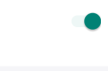
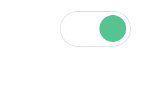
效果展示
- 自定义前
- 自定义后